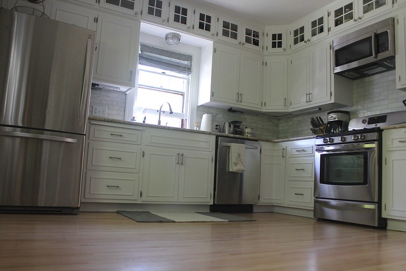
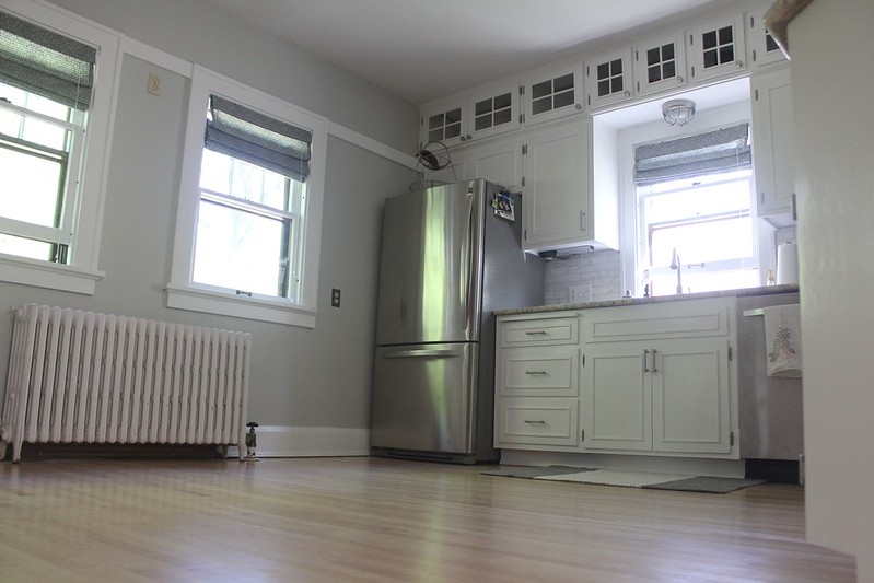
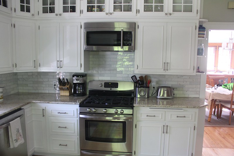
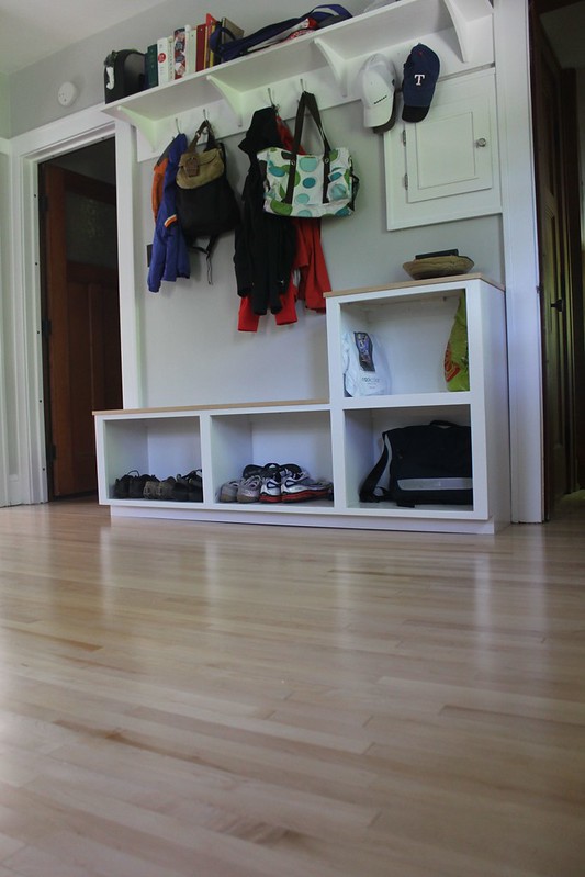
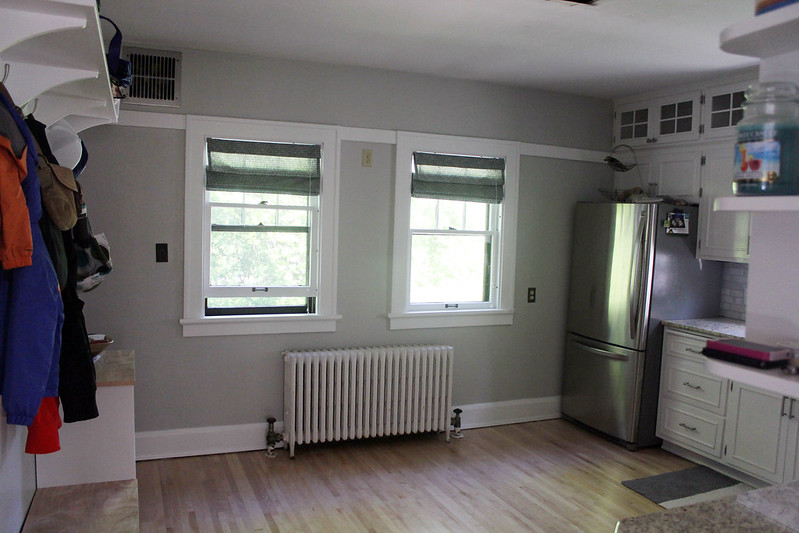
Since I last posted about the kitchen, we have done a lot more to this room: fixed all plumbing, replaced electrical boxes, tiled and grouted backsplash, installed all pulls and knobs, painted the walls and the woodwork including the windows, added window treatments, installed new above sink and under cabinet lighting, finished the back wall of storage, and bought a rug. Whew! The only two things left: install the already-cut glass into the upper doors and install our new above head lighting. Which, apparently, my least-favorite 'cafeteria' florescent light is going to be a pain in the butt even though it's taken down now. There is a giant hole that remains and so we need to do a lot of patching and drywall and other not fun stuff before we can actually install our new light. So I just left the ceiling out of my reveal pics. :)
Let's view some details, shall we?

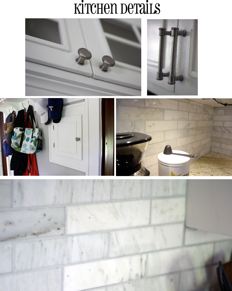
So I'm madly in love with our pulls and knobs, FYI. And the back splash turned out SO nice and I even helped put it up with Nate and his dad so I feel even more proud of this baby. Love how the backsplash pulls out the gray in our granite countertops, which also plays into our maple floors. I also adore our new back wall of storage including the laundry chute for the first floor. It's sort of like a little mud-room area in our kitchen which is a lot nicer than the giant cabinets they had there before (in my humble opinion).
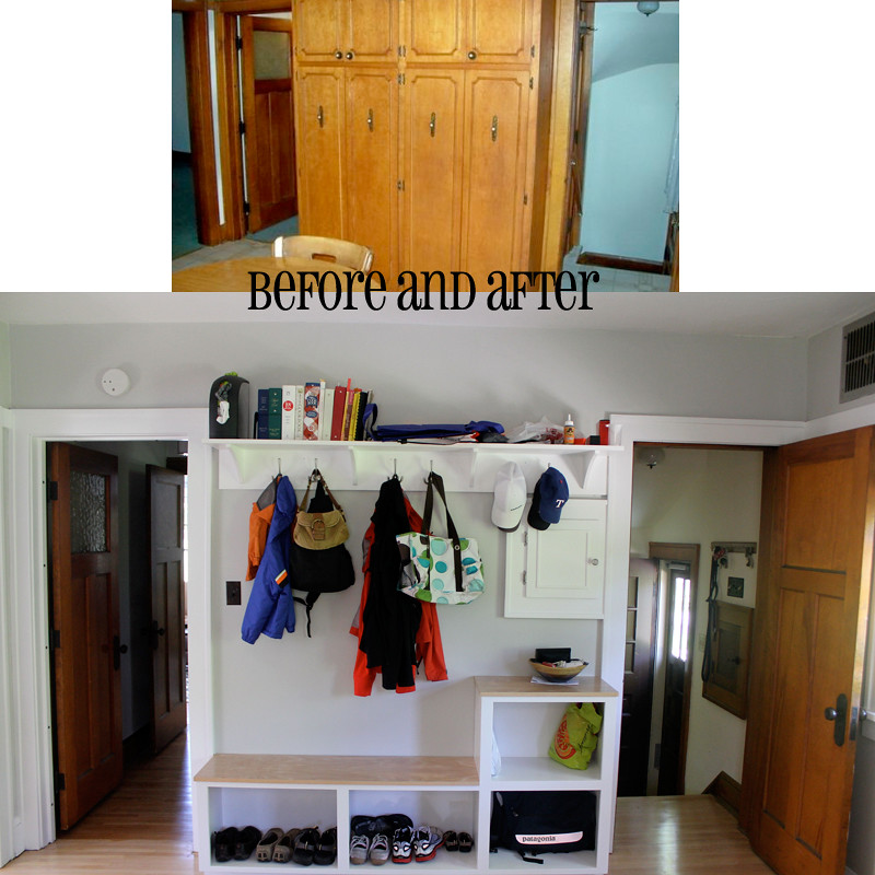
And as for the other 'before and after' shots?

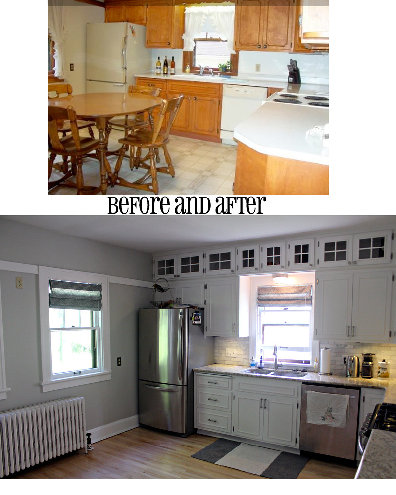
Oh, refaced cabinet doors. How I love you.

Looking out of the window by the sink, into our backyard makes me so happy now.
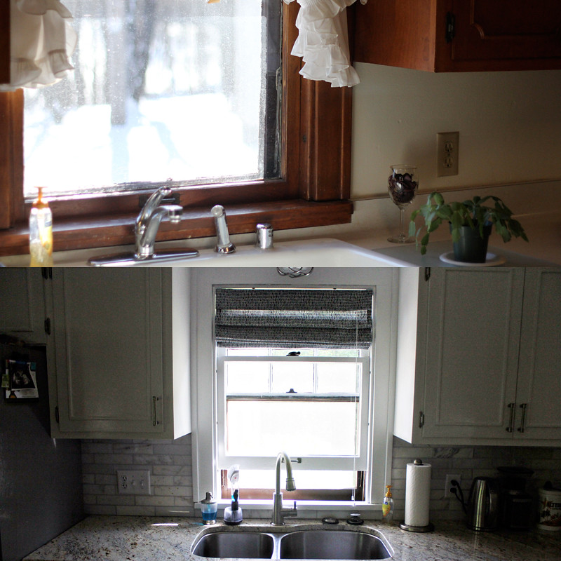
I feel like I explained a lot of what we did to this kitchen in my previous post, so I won't go into details about how we tackled this project. But I will just say that it's very 'us' and huge and spacious with so much storage compared to what we had before. I don't love to cook but in this kitchen, I feel like Rachel Ray. :)
And that is our DIY kitchen remodel. Thank you, God, that it's over.

Absolutely GORGEOUS!! You outdid yourselves here!
ReplyDeleteAmaze-balls (lol, excuse my french). I want!
ReplyDeletewow - this is amazing!
ReplyDeleteit looks AMAZING!
ReplyDeleteUNREAL. We're looking at houses and for the life of me I can't picture Before and After like you've just created. I see the old flooring and dated cabinets and I say, "Next!"
ReplyDeleteYou have a gift. It's beautiful.
It's absolutely stunning! I'm seriously, so jealous of your space and the work you guys did to complete a beautiful project!
ReplyDeleteOn a side note, did you take these pictures? For the first few, it looks like whoever did was laying on the ground.... I hope that wasn't you. :)
This kitchen is beautiful!!! Are you going to put in an island? You have so much space! I'm jealous :)
ReplyDeleteLove it! It looks SO great. Love all the details and your floors are to die for. They look so light in the pics and I love that. Beautiful room!
ReplyDeleteI die over that kitchen. Die. And I LOVE that you have the mud room space for your stuff! So wish we had room for something like that in our house. Great job you guys!!
ReplyDeleteI LOVE it! You guys did a great job! We're going to be redoing our kitchen soon and I think I'm going to send these pics to my husband for some inspiration. Love the see through cabinets at the top.
ReplyDeleteThat is a HUGE, amazing, and beautiful difference! I can only imagine that it added both functionality and value to your home too, which is awesome!
ReplyDeleteSO AWESOME!!! What an amazing kitchen - I'm definitely jealous!!
ReplyDeleteJulia, it's gorgeous! I love it!
ReplyDeleteJust stunning Julia! I'd expect nothing less!
ReplyDeleteOh my goodness. I think I die for this makeover. Way to go!
ReplyDeleteIt's gorgeous!
ReplyDeleteIt's incredible!
ReplyDeleteThanks guys!
ReplyDeleteJill--yep, that was me on the ground snapping pictures. It's not too bad if I lay on my side and crank my neck a bit. :)
Julie--we have talked a lot about an island but for now, I think we will just enjoy doing cartwheels in the open space. We don't truly need extra counter space so I'm not sure an island would make sense? Maybe someday.
Kristal--the floors really are that light. At first I wanted them to match the rest of the house but since the flooring guys said you really can't stain maple, and the rest of the house turned out to be oak, we went with no stain. Love how light and airy it makes the kitchen.
Wow! It's fabulous! I have no idea how people like you have such a vision for worn out spaces. Great job!!
ReplyDeleteAdore that kitchen!
ReplyDeleteLooks great!! Fabulous work!
ReplyDeleteIt's amazing! Great job!
ReplyDeleteBeautiful!! Love the backsplash/countertop coloring.
ReplyDeleteok, i don't know if you already covered this, but where did you get the storage units? i love that it has floor-level storage for shoes, but also a table-height surface for keys and other stuff!
ReplyDeletebought? DIY? do tell :)
nicky
Nicky~The back wall of storage was built by our old neighbor, same guy who fixed up our cabinet doors. We drew it up after looking on Pinterest a lot. I wanted the lower storage for shoes, and Nate came up with the little table top height part to blend in the laundry chute. And I knew I wanted a big shelf with hooks. Very easy for us to 'make' since all we did was tell our neighbor how we wanted it done! :)
ReplyDeleteI cannot believe the difference, especially knowing how you did it yourselves. I love the backsplash too. Our kitchen doesn't have any (maybe they ran out of money, ha!) and when I get a job, that's one of the things I'd like to do. And the little lockers-I really want to do that too in our mud room. Great job-it looks fantastic!
ReplyDeleteLove your backsplash! we are looking to do ours...where did you find yours?
ReplyDeleteUnknown--from the tile shop!
ReplyDelete