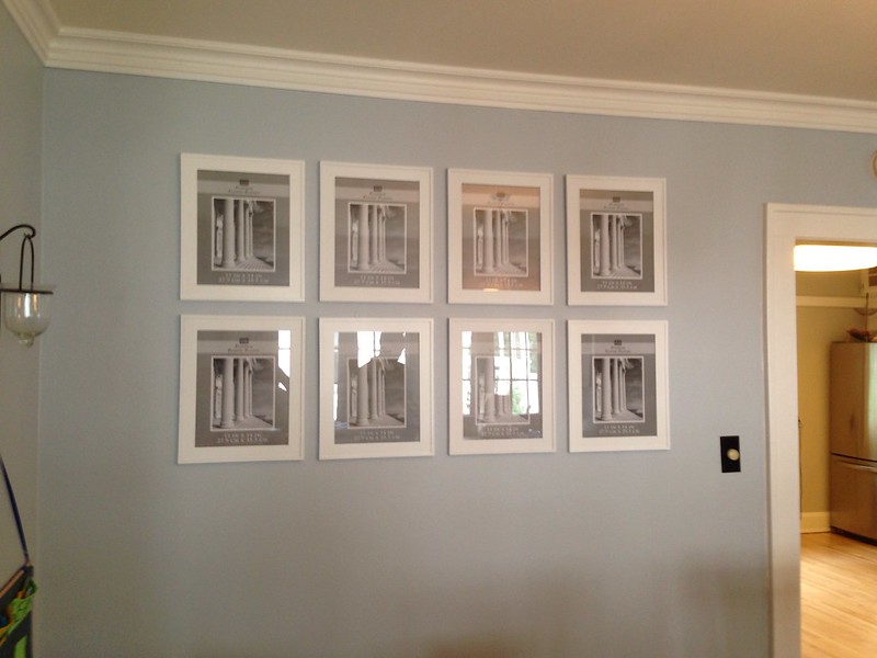
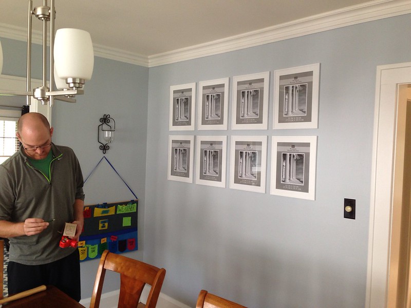
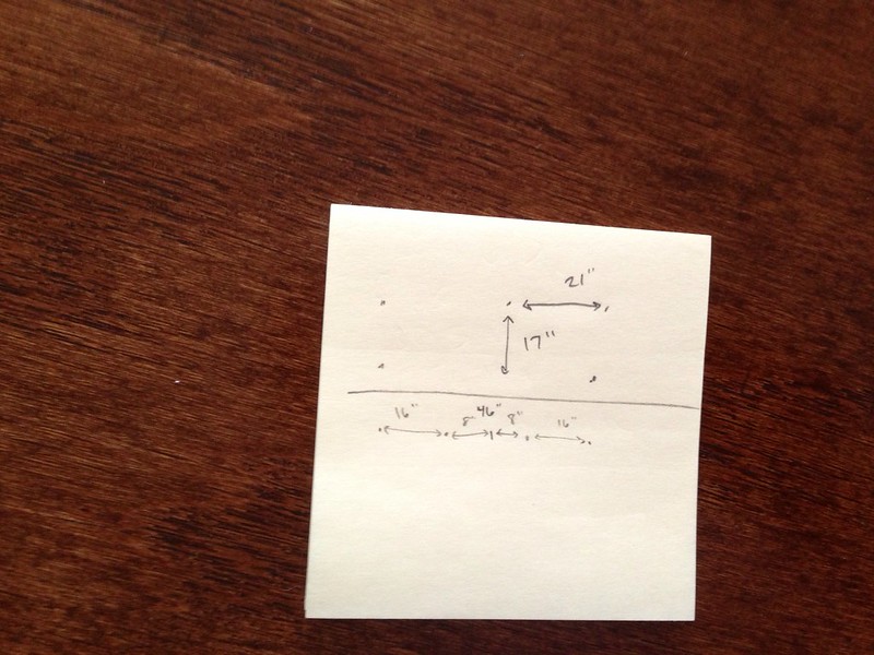
We used to have two canvases on this wall and it recently started to bug me because this wall is huge and the two canvases just didn't fill up the space well enough for my tastes. I knew I wanted a lot of BIG photos on this wall and am really into the repetitive look of identical frames hung at the same distances, as opposed to a variable pattern like we used to have at the duplex.
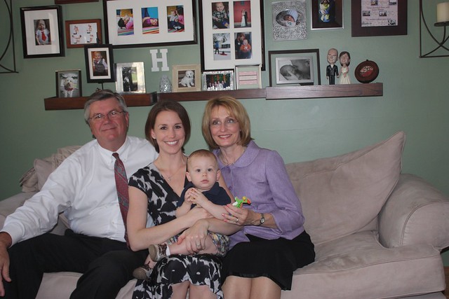
(This is the best picture I could find without searching my Flickr for years. Kind of love this one of Truman with me and my parents, when Nate graduated PT school. Over two years ago!)
ANYWAY. Enough reminiscing.
I am really into the clean, symmetrical look on my walls now. So I bought these eight white frames from Michaels, after looking seriously at Crate and Barrel and Pottery Barn. Nate told me to 'splurge on nice frames for a change' but I just couldn't do it. Because these from Michaels are not total crap, they were BOGO FREE, and $35 a pop. The ones I really loved from Pottery Barn were $40 and not buy one get one. Michaels speaks to my inner tight wad, I suppose.
The photograph is going to be 11x14 and the frame itself is probably 13x16 or something. Pretty huge. And I'm really excited to pick out my eight images to hang in these babies. I decided to go all black and white after some debate and all of the images will need to be verticals, of course.
This is where I need your help, my friends.
I can only choose eight pictures. I want one of those to be a wedding photo and I cannot, for the life of me, choose which one. I had a lot of fun pouring over the thousands of images we have on DVDs from our photographer. Probably a little too much fun, actually. Gah, over six years ago!!
Which one do you like the best?
A: From when we first saw each other in the hotel room, before the ceremony. Would convert this to black and white.

B: In the hotel still, before we left on the trolley for pictures (all before ceremony). Love this one.
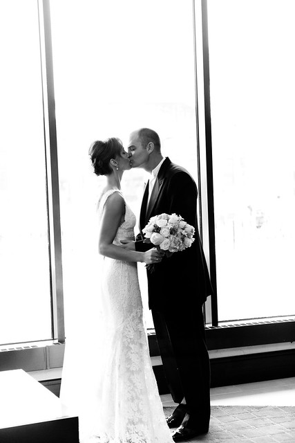
C: From the 'around the city' shots we did before the ceremony. Would convert this one, too. Very posed but still pretty classic.
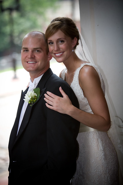
D: The Kiss!

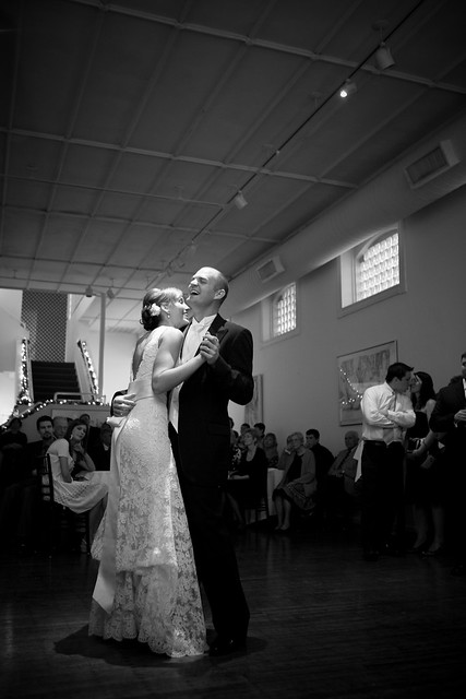
E: The first dance. Love how we are laughing and so happy here. Such an amazing day in our lives.
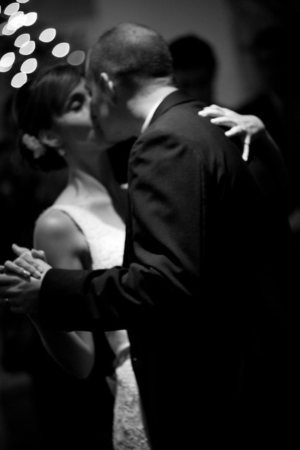
F: Another first dance shot. It's blurry but it's always been a fave.
G: In front of the red brick wall that is gray here;)

H: Kissing in front of said wall. I would lighten this one up a bit. Not sure why it's so dark.

I: Another posed one, would need to convert.

Opinions on the wedding picture to be hung on our wall???


C, G, or I. I can't decide!! :)
ReplyDeleteThe laughing first dance photo! Love that one!
ReplyDeleteI love #1! It is precious!
ReplyDeleteAugh! So hard! I am the same way with my wedding pics. There are just so many good ones, how to choose just one or two to hang?!
ReplyDeleteIt was a tough choice but I think I narrowed my picks down to D, E, G, H.
Good luck deciding. ;)
Tough decision, they are all beautiful (and your dress is gorgeous!) but I am choosing B and G. Can't pick between those two.
ReplyDeleteI pick E. You both look so happy and it's not a posed picture, but they're all beautiful!
ReplyDeleteRare commenter :). Love these! My faves for the wall are the kiss and the first dance. LOVE the first one but I feel like it's almost too intimate for the wall. It is the cutest, though!!
ReplyDeleteA or E!! Candids are always winners in my book and I love how genuinely happy you both look in those two pictures. :)
ReplyDeleteI say B, D or G.
ReplyDeleteand i really really hate to say it because i know its already done but i think the frames could come down about 6 inches. It just looks like the top ones are too tall and you need to look up to see them. I think they could be a little more eye level. That is my two cents :)
I really like A or E...but honestly any one of them would be great!
ReplyDeleteI like A, D and E. I think if you could crop E closer so you and Nate are the main picture (as opposed to so much background), that would be my pick. They are all great!
ReplyDeleteLove all of them, they are really beautiful. My favorite is G, that one is amazing!
ReplyDeleteI LOVE A & D! In A you're totally radiating happiness...how could you not smile looking at that everyday :)
ReplyDeleteA or E!!! I have a similar photo of my husband and I dancing at our wedding. One of my favorites.
ReplyDeleteAlso, I'm stealing this gallery idea for my dining area! I've been trying to decide for ages on what to do and the simplicity of this is PERFECT. :)
I think they are all beautiful...but I love D.
ReplyDeleteI either like C or E - what other pictures are you putting up? If it were me, I would try to balance posed shots with more candid shots. I.e. if you're doing photos of the kids that are all posed, I would probably do the candid one, if the kid shots are candid, I would do a posed one. However, ALL the photos are gorgeous and this makes me want to do the same thing in my own house!
ReplyDeleteJodi---just you wait. You guys will be helping me pick the other images, too;) probably more posed for the rest , I think. I don't know. Very indecisive.
DeleteEither the blurry one or the first one. Love them both. I don't think of the two of you as posed and formal so I would want something that is more "you" on the wall.
ReplyDeleteB or C, unless the montage ends up being mostly candids in which case E is it!!
ReplyDeleteI have been a quiet reader of your blog for awhile now but I wanted to comment on this post. I absolutely love A! It's such a gorgeous picture of the two of you!
ReplyDelete~Amanda
I like all the pictures but no. 2 and 5 are my favorite pictures.I like that they look so real :)
ReplyDeleteMy vote is for the very first one. They are all great but the first one just seems so spontaneous and very sweet. Just pick one that makes you the giddiest inside. Easier said than done right? Anyway, you really can't go wrong with any of the pictures.
ReplyDeleteLove the first one. It radiates contentment and true happiness in both of you.
ReplyDeleteI can't decide between B and E...they're all so beautiful, though! Love your dress.
ReplyDeleteB and I
ReplyDeleteI think you need a kissing one and a face shot one. So those are the ones I choose! Can't wait to see what you pick in the end!
I vote for A or I!
ReplyDeleteI kinda love the first dance blurry one. There's something about it that just feels romantic and intimate. I also adore the first one. Are you doing a mix of color and B&W photos or all the same? Maybe that will help narrow down your choices.
ReplyDeleteDefinitely "the kiss"! Those will look great on your wall.
ReplyDeleteMaggie--the bottom row is actually below eye level for me, I stare right at the space between the rows. We are tall, and I don't want little hands reaching up to knock these down since we play a lot in this room :) so higher the better for us !
ReplyDeleteE or G!!!
ReplyDeleteA, E
ReplyDeleteI like B, the way you both stand out in the light looks beautiful.
ReplyDeleteAHHHHHHH I love them all.....
ReplyDeleteI say A or H.
First one!! :)
ReplyDeletelaughing one!! omg so precious! would help fill the room with happiness always :)
ReplyDeleteThe dancing, laughing one. Like most people, including myself, you probably have had so many of the traditional posed ones on display for years. The candid fun one will remind you that you've still "got it" years later!
ReplyDeleteB or H!
ReplyDeleteThey are all BEAUTIFUL... but for the wall, I definitely think A. I love it!
ReplyDeleteI vote for A. Though they are all pretty great!
ReplyDeleteThey're ALL gorgeous...but "B" is STUNNING!!
ReplyDeleteYou could always rotate, you know! ;)
I love A, B, and D! Also, I'm about 99% sure we had the same wedding dress. Monique Lullier Miranda? Great taste- best dress EVER! :-)
ReplyDeleteMegan, yep! That's it. Loved it.
DeleteA,c, or I they show your pretty face. I chose one similar to A for the gallery wall at my house.
ReplyDeleteD! :)
ReplyDeleteB or G. I'm all about the black and white and the candid shots. I think I lean a bit more toward G, though I like that B is a bit more up close...
ReplyDeleteLove E and G. G is simply a great shot. Nothing gets in the way as the focus is on you two. E captures such a happy moment. Whatever you choose they are all great.
ReplyDelete